Few years ago, when the digital device industry jumped into the smartwatch market, interestingly it was Tag Heuer that first came up with the answer for my growing doubt of ‘would Swiss watch makers join the club?’
Of course, it is not known whether the launch of the ‘Tag Heuer Connected’ smartwatch at the end of 2015 was 100% its own decision . Because there were circumstances indicating that the watch brand felt threatened by the growth of the smartwatch market and that it got tempted by the united front of Intel and Google. But the appearance of the Swiss watch maker in the smartwatch market, which everyone expected to fall on its own, was a blast for a turnaround of such an atmosphere.
However, the first impression of the Tag Heuer Connected was not as powerful as it would be for a watch made by a Swiss watch maker with reputation. Rather, it was a bit shocking that for a price tag of 1,500$, which is way more expensive than other smartwatches, the package was not classy at all to come with a product that should be worth paying just for the Tag Heuer design and exclusive watch face designs.
But Tag Heuer fans did not easily give up on this product. Not only was the watch the most affordable one under the name Tag Heuer, but also there was a way out to replace to the automatic three hands movement if you would pay an additional amount after the warranty period. Tag Heuer’s wise handling of providing buffer for the uncertainties of having a smartwatch, gave itself more room to prepare for the next product. This is why Tag Heuer Connected Modular, the second generation of Tag Heuer’s smartwatches that seems to have got the hang, looks more meticulously prepared.
Package’s extreme make-over
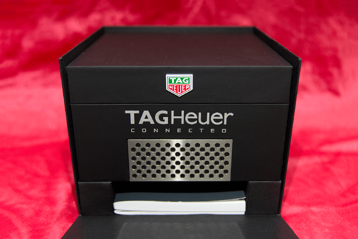
I couldn’t leave out the story about the extreme make-over of the packaging before I deep dive into the meaning of ‘Modular’ from the name of Tag Heuer Connected Modular. I would have omitted this part if the packaging of the Connected Modular wouldn’t have been that much awful. Those who were shocked by the packaging of the first generation Connected Modular that looked like the parts were roughly crammed into a deep blue plastic case, would definitely be on the same page with me.
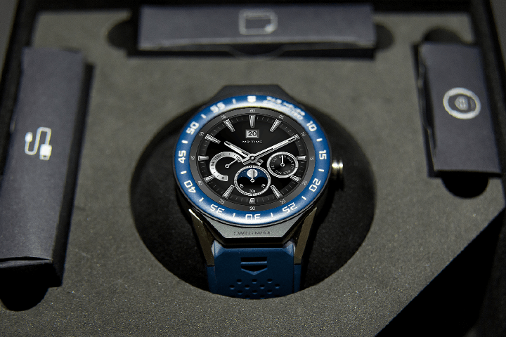
However, the packaging of the 2nd generation indisputably changed, breaking away from the nightmare of the 1st generation. The big and firm box which didn’t allow even a moment to recall the plastic case, totally changed the atmosphere. Inside the package, there is a separate box containing the main body and other parts, and accessories such as the charging adapter and USB cable were again in small paper boxes to hide the cheap image as much as possible that can be felt from accessories of electronic products.
The package of the 2nd generation is definitely better than the 1st generation from every aspect. It is luxurious to the extent that those who haven’t experienced the 1st generation and only got to know the 2nd generation, would not recall the word ‘disappointment’. But packaging is probably not the maximum value Tag Heuer has got to offer. It made just the right amount of efforts that match the value.


The lugs, even more important than the module
The 2nd generation Tag Heuer Connected might look similar to the 1st generation. The design of the bezel engraved with numbers, thick main body, tough-looking lugs(the loop part of the main body where the strap is clipped in) and the bold button part look exactly the same. Although looking similar, one could easily find the differences. The bezels that used to have embossed numbers have all been replaced to bezels with engraved numbers, and the slightly tilted bezel was also horizontally adjusted.
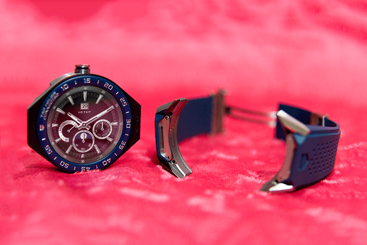
But the most certain difference was somewhere else. The name ‘Modular’ wasn’t added for no reason. The Tag Heuer Connected was built in a way to separate the main body and the lugs. It’s not just about slightly pulling out the pins to replace the strap, but it’s actually taking the main body apart.
Because of that, users can buy a Tag Heuer Connected with different bezel designs and straps to customize the watch. There is a wide option to choose from such as black, blue, yellow, red and orange bezels to the most high-end model that removed the numbers but added diamonds to the bezel and rug. Tag Heuer has released a total of 67 models including both the 41mm and 45mm models.
The modular structure of which the lugs, where the straps are connected to, and the main body can get separated looks quite interesting, but the problem is that Tag Heuer does not sell the lugs and straps separately. Unless Tag Heuer changes its sales policy, one would have to have more than two Tag Heuer Connected Modular watches to experience the diverse effects of changing the module and the strap. In other words, if you have only one Connected Modular, there aren’t any advantages at all. But the situation gets different if the user is someone who continuously uses the Tag Heuer Connected Modular products. Whenever the user buys a new main body, the remaining lugs will still be useful. Lugs which are hard to get, will make it hard for users to leave Tag Heuer.


Customizing Carrera’s watch faces
What would be the popular watch face that is illegally consumed in programs that change the display of smartwatches? It’s my personal opinion, but I assume that at least Tag Heuer Carrera will definitely be in the top rankings. Embedded with sophisticated chronograph for motor sports, Carrera evolved through generations for the past half century and has become the iconic face of Tag Heuer.
The fun part of the Tag Heuer Connected Modular lies in the watch screen of Carrera. Basically, since the watch screen of the Connected Modular is the screen of Carrera, it might not look special. Also, for the 2nd generation, a few classic Carrera screens can be easily chosen from the Wear OS.
But with the 2nd generation, numerous Carrera watch screens can be designed by the users themselves. It’s quite fun to create one’s own watch face by changing the dial, metal, luminescence and highlight effects in the Tag Heuer Studio after installing it on the smartphone. Since even the inactive screen where colors are excluded, looks clearly like the Carrera watch, even the black and white watch that can be seen during the always-on mode is pleasant.
Of course, there is a fixed template for the dials, hands etc. But templates of the past and present Carrera watches have been substantially reflected to assemble up to 4,000 Carrera watch screens. If you would change the Carrera watch screen every day, you would be wearing different watches for almost eleven years. If separating the module and the lugs is the modular concept of the hardware, then Tag Heuer Studio seems to complete the modular concept through software.
An honest smartwatch without cheap tricks
As you can see, the Tag Heuer Connected Modular is much thicker than other smartwatches but is not overly heavy as you would expect. Since all parts such as the module, lugs and clips are made of Titanium Grade 5, they are strong enough to endure external impact and are blocked from deformation such as twists. Of course, titanium substantially reduces the weight. But it’s not easy to type the keyboard with the watch on the wrist as the buckles are thick.
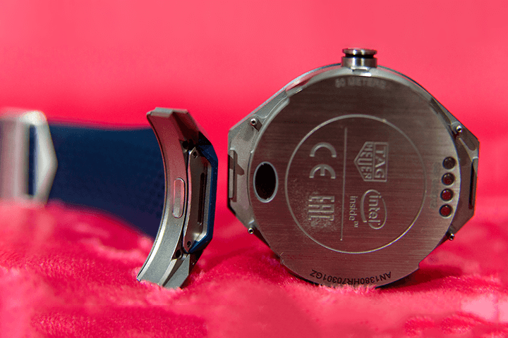
Since Tag Heuer focused more on making a highly stable smartwatch, it didn’t include any sensors on the backside other than the contact socket for the charging dock. As the watch is powered by Intel’s Atom processor, both the Tag Heuer and Intel logos are engraved on the back. Battery efficiency is also fairly ok. The watch can be used for almost two days with a single charge and the power efficiency was better than the previous generation. For reference, the Modular 45 that I’ve reviewed has a RAM of 512MB and a storage of 4GB with various embedded sensors such as GPS, NFC, accelerometer, gyroscope and vibrations/haptics engine.
The display resolution of the Connected Modular is 400×400 but looks slightly less refined as the screen is 1.39 inch big. Nevertheless, the pixels that depict the Tag Heuer logo and various chronographs, the watch hands and the tachymeter are not that noticeable. This means that Tag Heuer didn’t only rely on the performance of the display. It also worked hard on the displayed graphics.
The ability of running a Wear OS-based app is not bad too. But the focus of the review shouldn’t have to be placed on how the app is run, because so far, the Tag Heuer Connected Modular is definitely an easy-to-grasp device. The conclusion of a smartwatch that focuses more on the functions of the watch and has a more durable, strong and stable build centered around Carrera’s watch faces, is simple. It’s that the watch is as close to the essence of a watch, so that you don’t feel the need to find and explain about the new functions. The best answer to how you can make a smartwatch look different without mentioning the watch brand, can be easily found from the Tag Heuer Connected Modular.
HIGHS
- Customizing with about 4,000 watch faces of Carrera
- Strong body and parts made of Titanium
LOWS
- Ridiculously expensive
- Lugs and bands are not sold separately
- Humble charging adapter


