As soon as I heard the name, a word that had been in the back of my head popped up for the first time in four years: TicWatch. It was very surprising, as I tend to easily forget all the newly emerging smart watch manufacturers. However, TicWatch, which I had heard of several years ago, came to my mind. It may have impressed me more than I thought.
Looking back, TicWatch was indeed impressive. When smart watches were trying to target the public in 2015, TicWatch tried to pioneer the market all by itself in China. The company developed TicWear, its smart watch OS, which boasted a unique and creative design featuring a slide touch that rubbed the side of the body without a crown or a chronograph button. However, TicWatch didn’t support languages except Chinese, which made me not buy the watch. That was the end of the memory of the TicWatch, until recently when something rekindled my memory and enabled me to add to it: the TicWatch E.

More Digital Device than Watch
Even though I hadn’t seen the TicWatch in a while, it wasn’t very difficult to find visual similarities between the TicWatch from TicWatch E. Just like how TicWatch wanted to keep it simple with a round display, TicWatch E continued these characteristics. Mobvoi, the manufacturer of the TicWatch and TicWatch E, removed the index and tachometers that make smart watches look more like a traditional watch and stuck with a thin bezel with a single menu button without a crown or a chronograph button, just like the old TicWatch. However, unlike the old TicWatch that had a more analog and ordinary-looking watch frame with a metal texture and thin bezel, the TicWatch E looks closer to a digital device with its plastic material and blunt design.
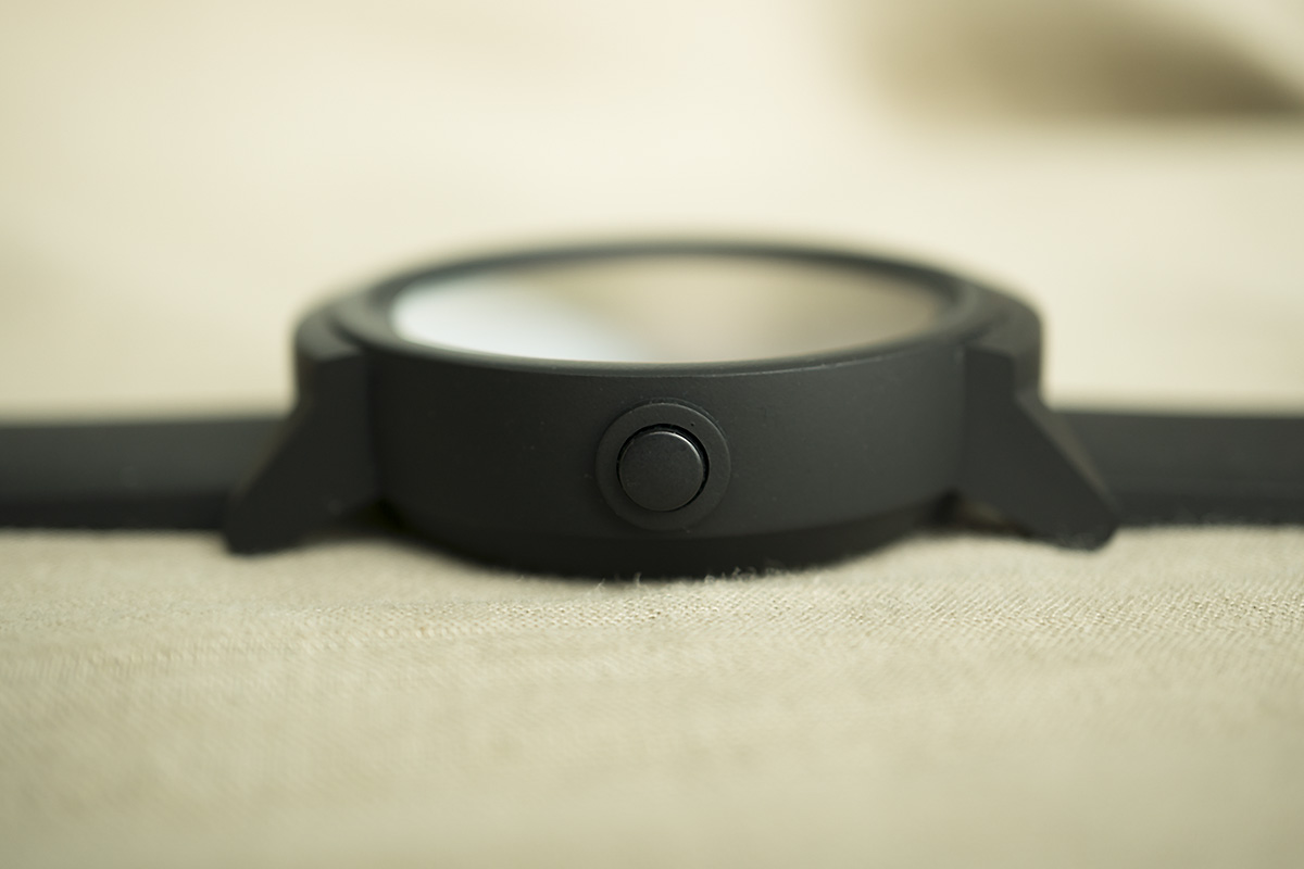
One interesting thing about the TicWatch E is that the menu button is on the left. In fact, TicWatch has always had a menu button on the left. This may seem like a bad decision, but it’s actually the right decision. Putting the button on the left seems abnormal if you are only thinking about the role of the button replacing the crown, which is almost always on the right side of the body. But those who use smart watches know that it is better when it is on the left. If the button is on the right side, it can get pushed by mistake when users cross
their arms or put their hands on their desk. Thinking out of the box and changing the location of the button prevents the TicWatch E from malfunctioning.
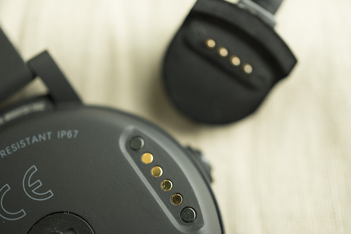
When you turn over the main body,
you can see a heart rate sensor and charging terminal. The contact point of the charging terminal is exposed without being hidden, but it is invisible when you are wearing the watch, so it didn’t bother me. I was just worried about my
sweat corroding the sensor. A long elliptical mark appeared on my wrist when I took off the TicWatch E that I wore for a while. I wondered what it was, and it looked like the protruding oval part around the heart beat sensor had been pressing against my skin for a while. The sensor is designed to block light, but they didn’t seem to expect it to press against people’s skin.
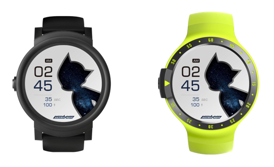
Ticwatch E and Ticwatch S
with MR.TIME watch face ASTROBOY GALAXY
Focus Only on the Basics of the Hardware
TicWear, the independent operating system responsible for running TicWatch 2, wasn’t on the TicWatch E. TicWatch E uses Google’s Wear OS, and because the operating system has changed, language and app options have become more abundant. I experienced no problems downloading Wear OS after setting the language to Korean. You can enjoy all the basic experiences available on Wear OS, including Google Assistant, health care features like steps and exercise, heart rate measurement, smartphone alarms, and more. The watch at least does the job of covering the basic Wear OS features.
However, there is a little ambiguity about the characteristics of the TicWatch E. The watch does not need external installed apps to do basic tasks in Wear OS, but you can get more detailed health data by installing the Mobvoi app. For the first few days that I ran around wearing the TicWatch E, before I went to bed I opened the Mobvoi app to see my daily number of steps and Calorie consumption estimates. I don’t know when, but my sense of obligation about this routine eventually wore off. The Mobvoi screen, which is very similar to Apple’s health app, was not interesting at all, and since you can see the same results on TicWatch E, I didn’t feel any need to open the app.
The TicWatch E’s default face is also awkward. The watch face is not just a place to display time, but is the most important means of emphasizing hardware. In this case, it is hard to feel any beauty from the face of the watch. A 1.4-inch OLED display (400 x 400 pixels) at 287 dpi can be a
bit sloppy, but for the price it’s hard to find a basic watch face that boasts a better display. It seems clear that Mobvoi has focused on hardware and missed design aspects of the display.
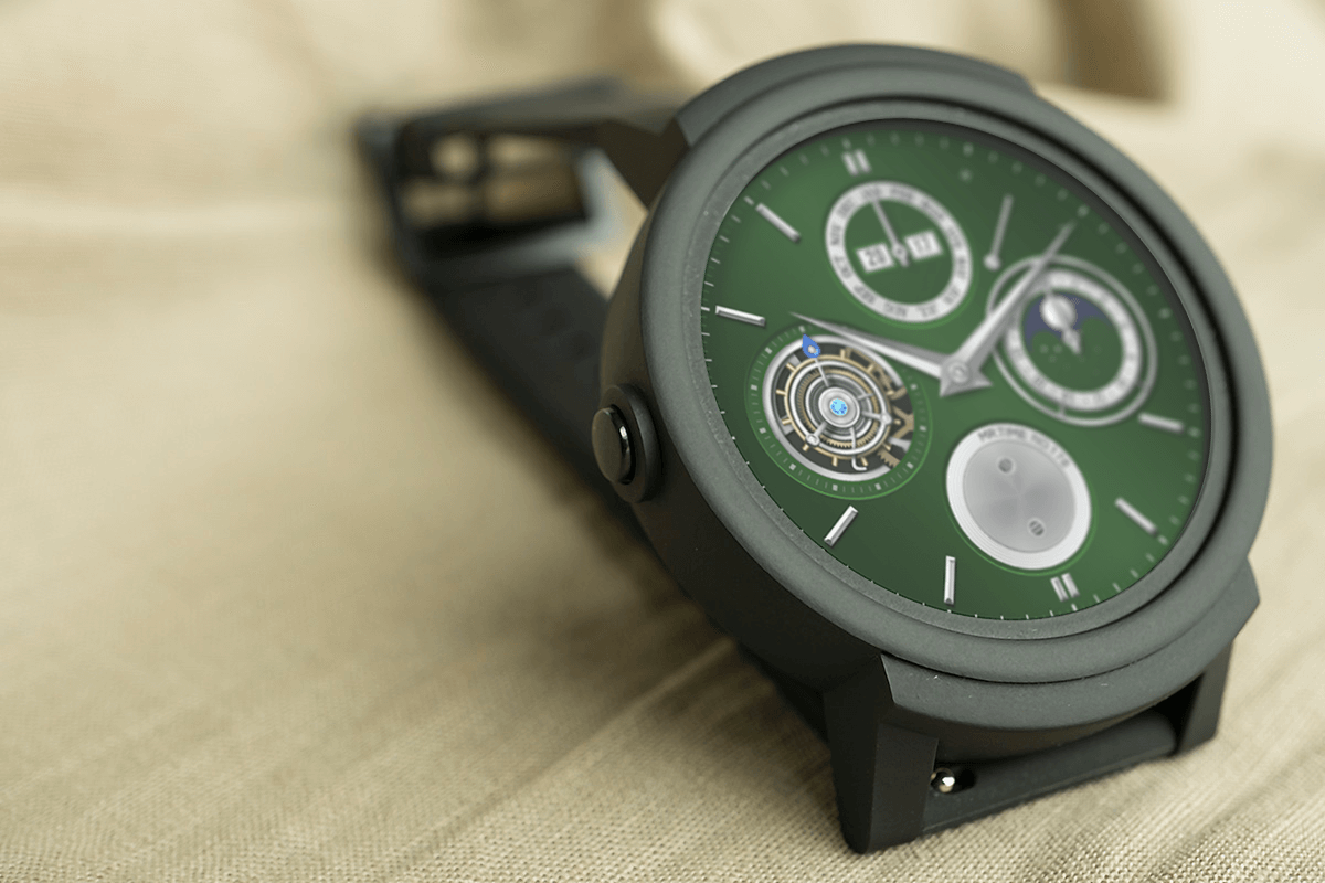
with MR.TIME watch face CAMBIO GREEN
Smart Watch, Optimized for the Non-savvy
I wondered how the battery or operating performance would hold up while the TicWatch E was running every program. Some specs are easy to understand, such as the 512MB of RAM and the 4GB of storage space, but I was curious about the ability of the MediaTek MT2601 (1.2GHz dual core) chip that was used in place of Qualcomm’s SnapDragon Wear 2100. Fortunately, the battery lasts a day on a single charge. While Mobvoi said the battery lasts for two days, in reality it never lasted two full days. Thanks to the use of a contact type charging terminal, the watch is easy to charge as well, even when it is plugged into a low voltage charger. In addition, its waterproof feature makes it not affected by weather, and it even has GPS.
The more you look at the TicWatch E, you can tell that it has a very good basic hardware to perform the functions of a smart watch. On the other hand, it is not so gorgeous, and there is not much to make the product stand out. Nevertheless, as a practical smart watch with no frills, it seems to carve out a clear spot among smart watches. This means that for those who are not yet familiar with smart watches or for those who have a clear purpose of simply using a smart watch without sophisticated features the TicWatch E is a great place to start.
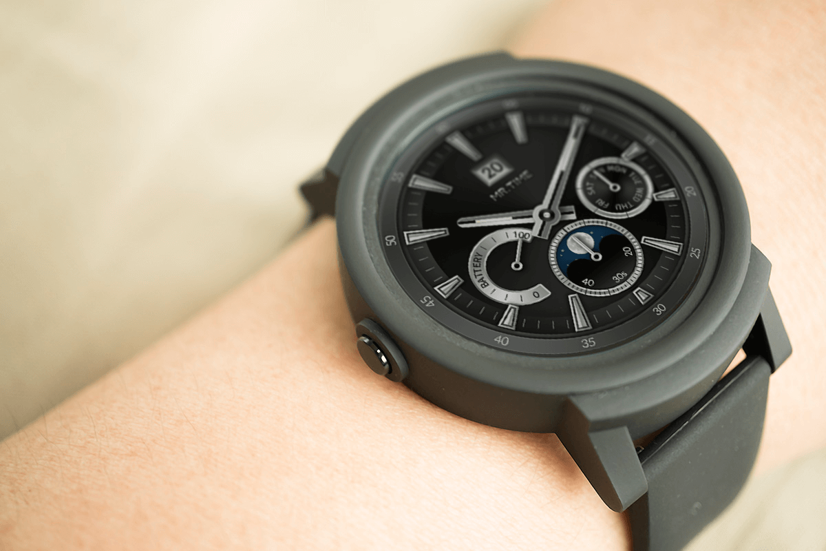
with MR.TIME watch face DOWNHOLE
STRENGTHS
- Simple design
- Affordable
- All necessary elements for smart watch functions in place
WEAKNESSES
- Lack of basic functions and usability
- Lack of notification on charge adapters that do not fit


