It’s a complex and subtle feeling to meet the new Gen 4 when it was only less than a year ago that I said good-bye to the Gen 3. Although I feel a bit sorry to talk about the Gen 4 when I still have the impressions of the previous generation lingering, I also thought the early arrival of the Gen 4 would make it easier to make a comparison with the Gen 3.
Anyway, I will be going through whether Fossil’s strategic choice to narrow the interval between the Gen 3 and Gen 4 smartwatches was right. Because the watch is still very new to know about the outcomes and we don’t even have enough time to focus on the Fossil Q Explorist HR Gen 4.
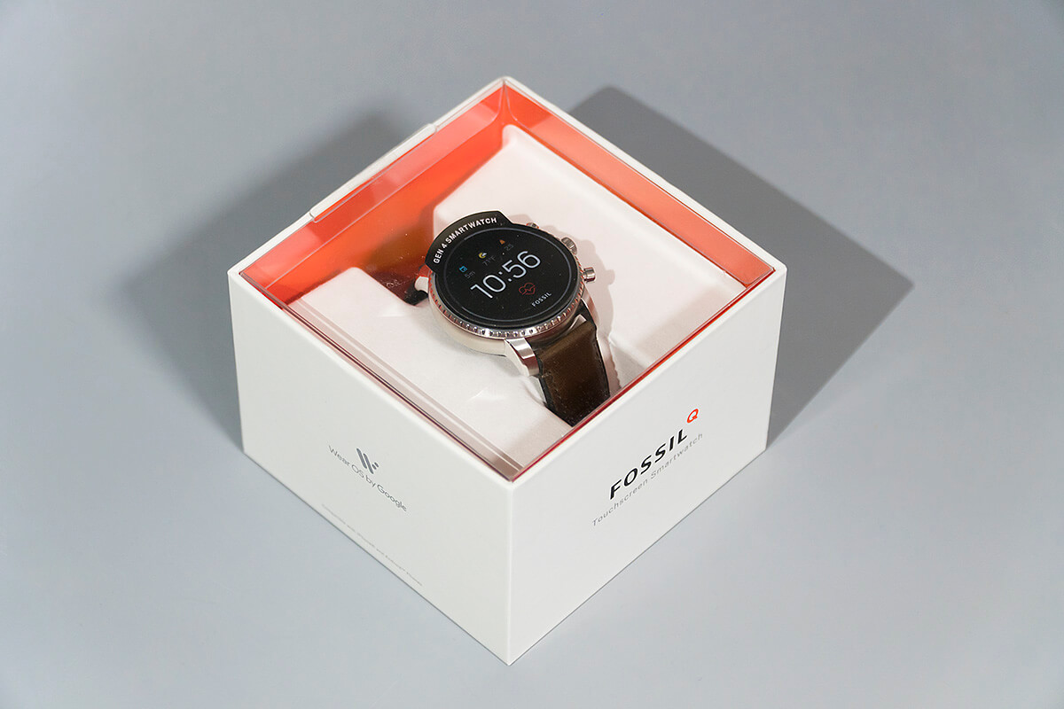
The product itself is the image of the package
Accessories included in smartwatch packages are pretty much the same. The package would basically contain a smartwatch, user manual, charging cable and a power adapter or a spare strap depending on the manufacturer. The size and structure of the box will differ based on how the accessories are put in.
Fossil’s smartwatch packages are all so different that you could distinguish the models just by looking at the packages. Since the release of the Gen 1 package that was full of various accessories, the smaller Gen 2 package and less items in the Gen 3, the Gen 4 package goes for efficiency. Rather than having more, the package only contains the product and necessary items and got rid of everything else.
The Gen 4 package is different from the one of Gen 3 that applied paper to all sides. Both packages look similar with the cuboid boxes, but the Gen 4 applied transparent plastic on the top cover, allowing users to have an immediate look at the Fossil Q Explorist HR. Previous generations attached pictures of the product on the package so users could identify the product. Using the product itself as the package image probably means that Fossil is confident about its Gen 4. But for someone who expected a fancier package, the package might look too simple.
As for the accessories, only what is necessary was included. A charging cable and user manual, and that’s all. Maybe I shouldn’t forget the Velcro tape.
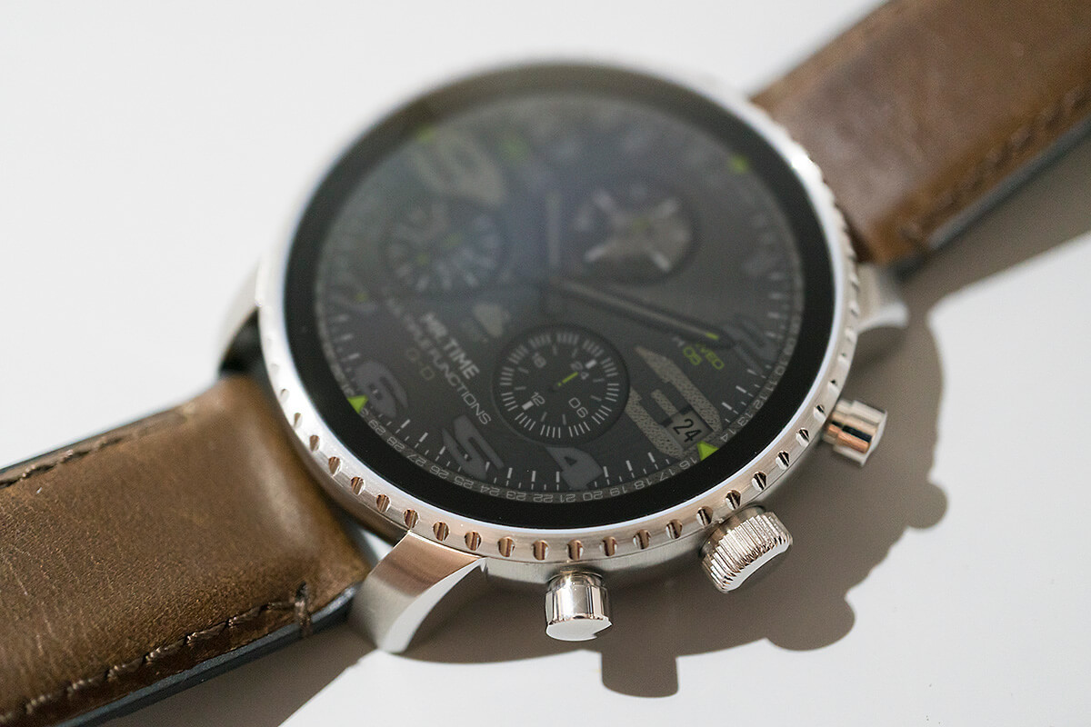
with MR.TIME watch face Q-D
No more of the confusing look
Thanks to the transparent cover, it was not difficult to find the features different from the Gen 3, without having to take out the Fossil Q Explorist Gen 4 from the package. It was clear that all the confusing parts of the previous generations were well organized in the Gen 4, but I put the watch on my hand to take a closer look.
First, the Fossil Q Explorist HR completely got rid of the optical illusion of the bezel that used to exist in previous generations. Unlike previous generations that had notched bezels rotating to the right and left like the Galaxy Watch, the Fossil Q Explorist HR reduced the thickness of the bezel to its minimum, despite a similar notched design, to just keep a decorative meaning of the bezel. Since the width of the notched bezel that surrounds the screen is much thinner than before, the 1.4-inch AMOLED screen looks relatively bigger.
Despite having an inner bezel between the notched bezel and the screen, the inner bezel looks like a screen in the display-off mode, making the display look much bigger.
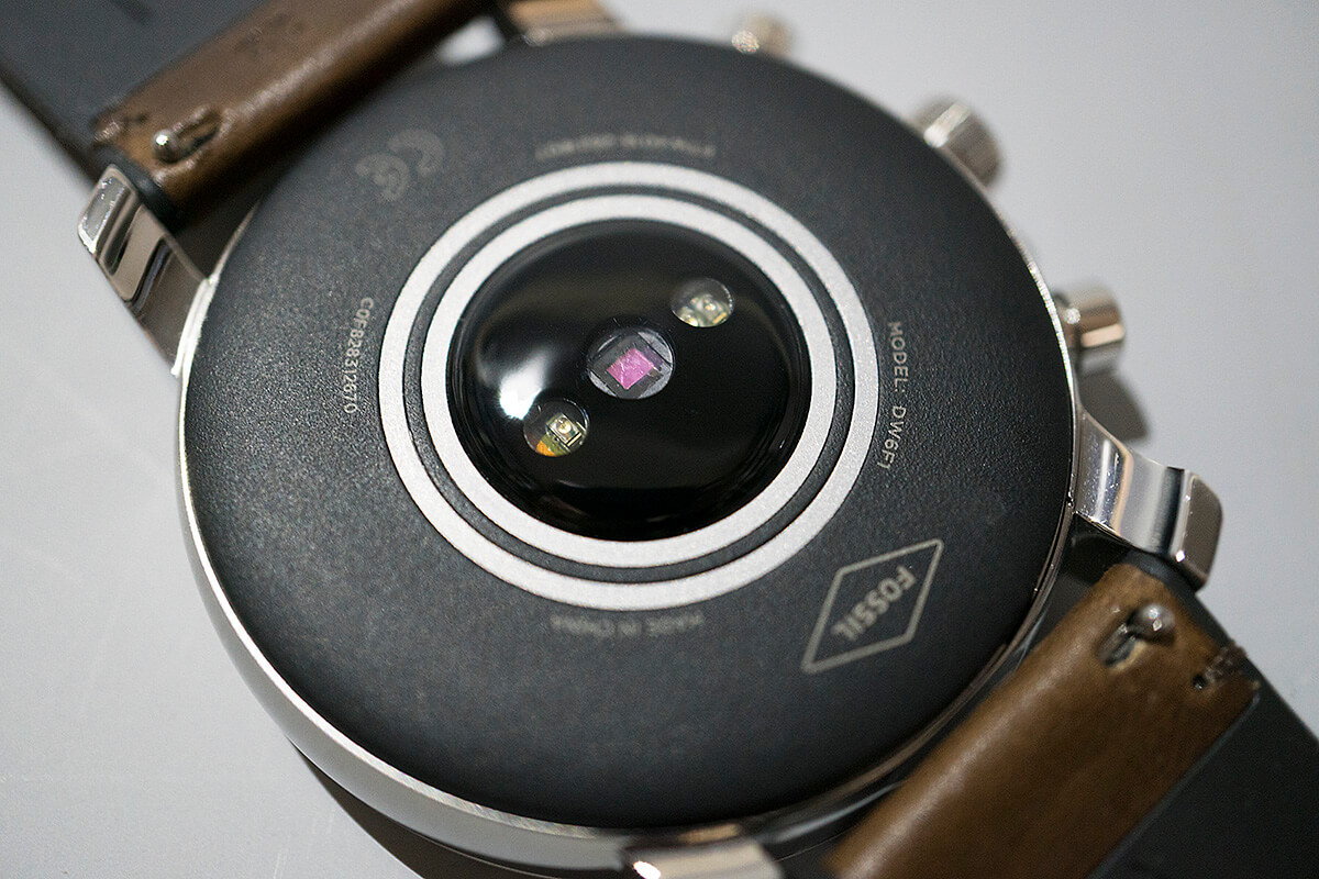
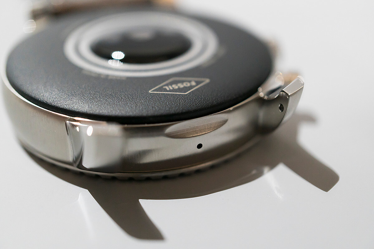
The scroll button placed on the right that plays the role of the crown as well as the top and down buttons are not really different from the previous models. But when you flip the watch, the back looks very different from before. Whereas the Gen 3 had a flat back without a sensor, the Gen 4 has a back that protrudes like the Apple Watch. It’s the first time for Fossil to add on the heart rate tracking sensor. But because the protruding part is not as wide as the Apple Watch 4, you could feel the convex part and its sides touching the skin when wearing the watch. It was a little surprising that Fossil seemed to have opted for this design for the functionality of the heart rate tracking sensor rather than the fit.
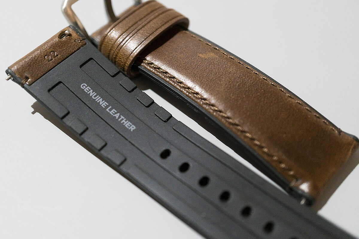
Also, straps made of dual material looked interesting. Leather was used on the outside and rubber-like material on the inside. It’s probably to support the durability of the leather strap that gets worn when sweat gets in. You shouldn’t expect a very smooth fit since the part that is in contact with your skin is not leather, but we should find our comfort in that it will look chic for a long time.
Too many functions that give trouble
The merits of the Fossil Q Explorist Gen 3 are that it is a smartwatch focused on fashion. It wasn’t really necessary to go through all the pros and cons because this watch only included functions that serve those who want diverse watches for the sake of fashion and just a few application programs instead of using the watch for its many functions.
Compared to the Gen 3, the Fossil Q Explorist HR has many new functions that weren’t included before. In fact, it is the first among the Q Explorist series to have added a heart rate tracking sensor. A heart rate tracking sensor can’t measure the electrocardiogram or ECG like the Apple Watch 4 and is used to monitor the heart rate. Normally people would check their heart rate after workout or excessive movements, but Fossil must have intended the watch to be used for workout. Because the watch has a GPS and compass that weren’t included in previous generations and built up water resistance to 3 ATM(water resistant up to 30m).
This is why when you press on the button below the crown, Google Fit that monitors the heart rate and workout will be run. Google Fit is a basic app that checks and manages the data of the travel distance, heart rate and calories consumed. But if you steel yourself to use the watch only for the purpose of workout, there will be many times when you feel quite burdened. First, the watch looks more like a fashion watch. Second, a watch that usually isn’t much heavy will add more fatigue to the wrist when working out due to its weight.
Another inclusion is the Google Pay. Users already subscribed to Google Pay can do payments with the Fossil Q Explorist HR on a Google Pay terminal instead of using the smartphone. For this purpose, the previously-omitted NFC has also been added. But this function can’t be used in Korea because Korea does not support Google Pay and therefore does not have such terminals capable of the transactions.
A hardware platform from the past
I expected the Fossil Q Explorist Gen 4 to have a new wearable platform. To be more precise, I hoped that the watch would have the Snapdragon Wear 3100, made in partnership by Qualcomm and Google. I hoped that Fossil would release a product that can be used for a long time with a more balanced processing capability and battery life, but the Fossil Q Explorist HR uses almost the same hardware platform of the Gen 3. In other words, more sensors and parts were added to complement the exterior and functions, but performances remain the same.
The display movement and battery life are almost the same as before because the Snapdragon Wear 2100 platform is still used. It is unpleasant to see a slightly stuttering screen when manipulating the menu as soon as pressing the crown. Of course, the same problem can arise when using the latest processor, but I found that this issue was more frequent than before.
Battery life is a little longer than a day. With a charging of one hour, the watch will work on standby for more than four days but will consume about 50-60% of battery when leaving the house at 9 am and coming back at 9 pm. The watch could maybe last until the next day without further charging, but I couldn’t guarantee. The more parts are added, and diverse functions are used, the more battery will be consumed. It wouldn’t be too inappropriate to say that this watch is a face-lifted version of the Gen 3, as the watch still uses an old platform despite all the add-ons.
Strengths
- A well-made design compared to the Gen 3
- Added the heart rate sensor and GPS to check workout and location
- A wide option of basic watch faces of a fashion company
Weaknesses
- An old hardware platform
- Awkward size of the main body and strap to be used for workout
- Battery life that lasts maybe only for a day


