‘Probably it will just snoop around the market and become history…’
There wasn’t a better conclusion for the Fossil Q Founder, the first ever attempt of the fashion giant ‘Fossil’ to tap the smartwatch market. It was just another round and solid-framed digital gadget with a processor, memory and display, not harboring the slightest spirit of Fossil. Despite the fact that it was the first collaborative work of Fossil, desperate to enter a new domain and Intel, anxious about the rapidly growing wearable market, the Fossil Q Founder failed to plant a seed of hope that Fossil could last long in the future of smartwatches.
I was surprised to realize that already three years have passed since the rather disappointing encounter with Fossil’s first smart watch, the Fossil Q Founder, until I got to meet this new product from Fossil. I was even more surprised that Fossil actually managed to release a fresh seed that could replace the bad seed from three years ago, while continuing its business in the smartwatch market. The Fossil Q Explorist is Fossil’s third generation smartwatch that proved my thoughts from three years ago were wrong.
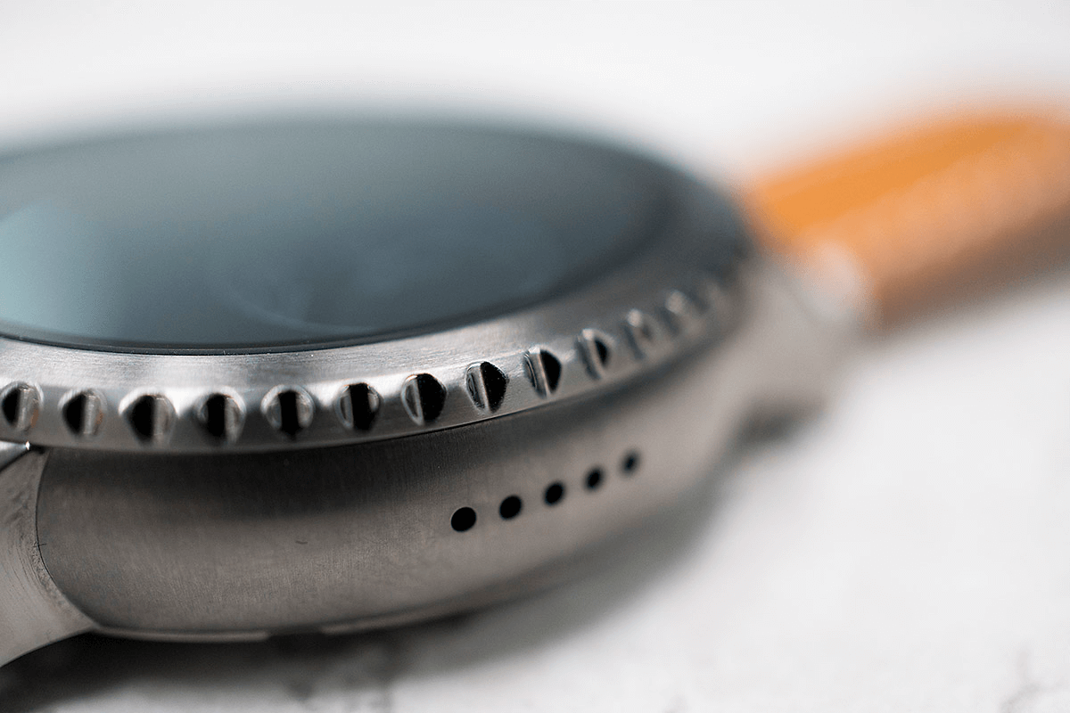
The moment I saw it, I took the bait!
It almost looked like as if it would rotate. Better said, it was luring me to give it a try. I could not resist the desire of rotating that too-naturally-shaped bezel. But the 46mm bezel of the Fossil Q Explorist (“Q Explorist”) held with my thumb and index finger would not move at all. Could something be wrong? Not at all. I just took the bait. The bait, which is the notched bezel that goes around the display.
The main reason why I thought I could rotate the notched bezel is probably because of the learning effect from the Gear S3, as the biggest perks of having a smartwatch with a notched bezel is the fun of rotating the bezel like a gear wheel. But, you will not find that kind of fun with the Q Explorist. So, here comes my advice. Do not take that bait as I did.
It was also interesting that I did not mistake this watch for Gear S3. Although both watches have a notched bezel, the Q Explorist has a smooth frame surrounding the display as it has gotten rid of the index and tachymeter bezel. The Q Explorist did not want to imitate an outdoor watch. It just removed all the complexities to fit the lifestyles of people living amongst a forest of skyscrapers. The Q Explorist is also slightly heavy with a weight of 76g including the leather strap, but it is not as heavy as to add more fatigue on the wrists of modern people.
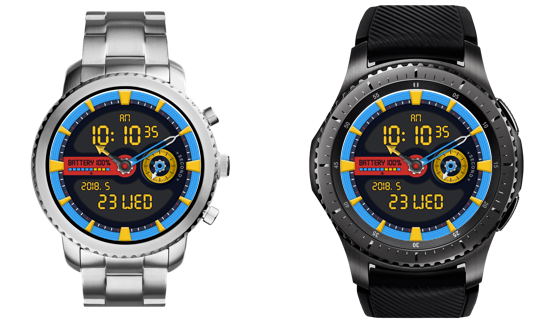
Fossil Q Explorist and Gear S3 Frontier
with MR.TIME watch face DEMANTOID
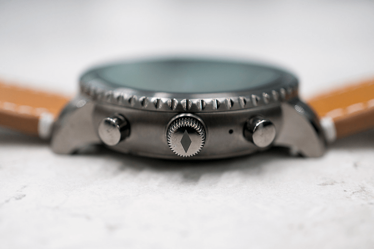
Setting an example with its crown design
Personally, I was never really fond of the Wear OS or Android Wear-based smartwatches because of the shape and feeling of the crown. If building up the functionality of the crown was in the realm of the OS, vitalizing its shape and mechanical touch was entirely in the realm of the manufacturing companies. However, only a few focused on the crown.
For someone like me who was full of such discontent, the crown of the Q Explorist was one of the good examples. The crown was accurately placed at three o’clock and not diagonally, and its thick and hard case reminded of the image of an old analog clock. Moreover, if you’ve experienced a smartwatch of which you couldn’t feel anything when rotating the crown, you will be quite satisfied with this one which will give you a good grip with a slight feeling of resistance.
But this does not necessarily mean that I am 100% satisfied with the crown of the Q Explorist. I still don’t like the weak mechanical sensibility compared to existing watches. It is because the crown still lacks that satisfying ‘click’ when rotating and pressing it, whereas the two chrono buttons placed above and below the crown have a good ‘click’. I suppose it is not easy checking the relative feelings of each buttons, but it is still a pity that such a trivial experience is not united with the crown.
Moreover, it is not always feasible to scroll the screen using the crown in all apps or interfaces. The role of the crown is a bit unclear in areas other than the home screen. This can be seen as a consistency issue of the Wear OS, but for users who do not think separately about the OS and device, it is something difficult to understand.
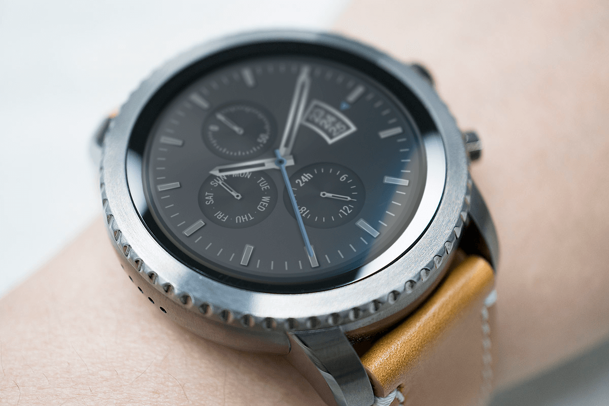
with MR.TIME watch face SEMPRE
and MR.TIME STYLE GRAY TAN strap
A watch that doesn’t stress you out
Using the Q Explorist, you will find something different from other smartwatches. This watch does not stress you out. It will not tell you to get up when you have been sitting for too long and not even summarize your daily amount of workout. It does not tell you to carry it for swimming or does not care whether you are having a good night sleep. The Q Explorist would deliver phone calls, text messages and SNS notifications from the paired smartphone, but didn’t seem to be a bit interested in controlling my behaviors. Thanks to that, I was able to live a very peaceful and calm life while using the Q Explorist.
Those of you who are already used to the nagging of your smartwatch telling you to exercise, could question about this one. The Q Explorist is not helpful for managing your health as it lacks the heart rate sensor, and it is difficult to use location-based apps since there is no GPS. The watch has an IP67 waterproof rating, but I would hardly recommend carrying it when swimming. You can still check how much you walked with the fitness tracker and directly install apps for Wear OS in the ample storage of 4GB to extend abilities, but it is difficult to find a list of basic functions from the Q Explorist.
For those of you who once got irritated with the excessive amount of nagging of your talented smart device, the Q Explorist with less basic functions and less nagging, could be a pleasant surprise. However, for those who are looking for smartwatches focused on functions, this smartwatch might draw some clear borders. Of course, it is too bad that there are relatively less functions. In fact, too less. This is why there are also obvious strengths. It is that you can get away from all the stress your smart device will give you.
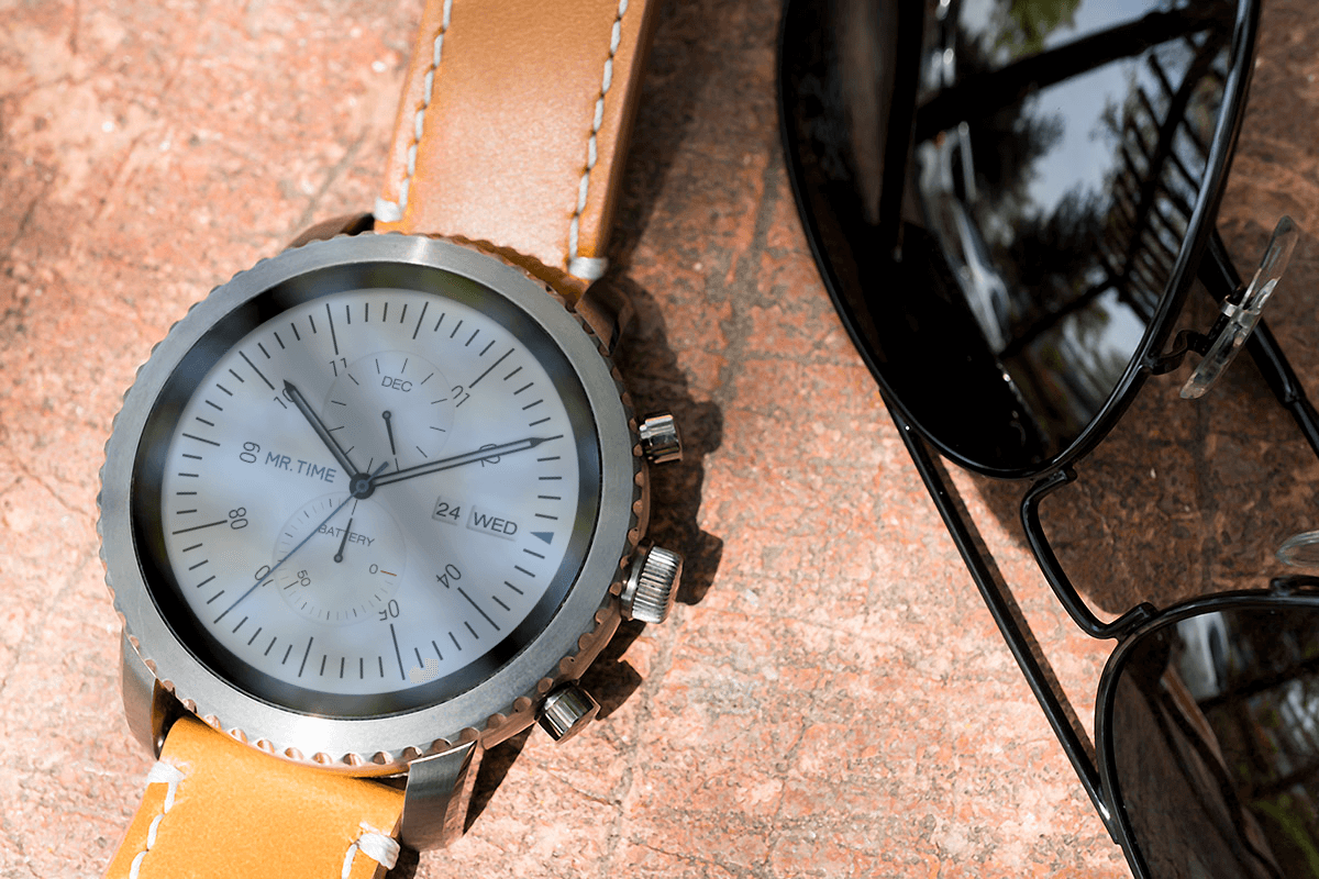
with MR.TIME watch face EDWARD
and MR.TIME STYLE GRAY TAN strap
Spacious display, sufficient battery life
Another strong point that would distract me from concentrating on the lack of basic functions of the Q Explorist, is the diverse watch face. Instead of the basic watch face of the Wear OS, the Q Explorist provides a watch face with its brand name ‘Fossil’ clearly engraved on it. The Q Explorist has 35 watch faces. Fossil must have put a lot of efforts for the style of its watch face in a 1.4-inch screen of 454×454 pixels.
Those efforts must have enhanced the originality of the basic watch. As Fossil reflected its sparkling ideas as a fashion company in the shape of the hour hand, form of the digital watch and characters, there are plenty of fun options to choose from. The fun doesn’t end at just choosing the watch face, but users can even choose their own colors and backgrounds. If the user stores the customized watch face in ‘my style’ within the Fossil Q app, the user can easily switch to the stored watch face.
You don’t have to be worried about the battery life of the Q Explorist, at least for 24 hours. Of course, the battery life depends on how much the watch is used, but even if you would go for work in the morning with the display ‘always on’ and come home late, you still wouldn’t have to worry about charging. You won’t be getting notifications once the device is automatically switched to battery saver mode when the battery is down to 15%, but I had no problems using the watch for almost eight hours. Although using the device for two days without charging is definitely not feasible.
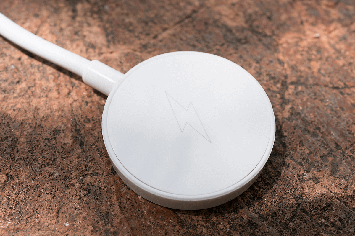
One thing should be kept in mind. Charging the Q Explorist is as easy as connecting it to a magnetic wireless charging pad the size of a coin which is connected to an USB cable for portability. The problem is that charging can be very slow if the power value of the USB adapter does not fit. If a 5V, 2A charger is used, about 30% will be charged within an hour but in the case of a 5V, 1.5A adapter, you will see almost zero % charging.
The DNA as a fashion company
To be honest, I feel more comfortable talking about the Q Explorist than other smartwatches. Probably because the watch does not hold many functions or performances to be assessed. Nevertheless, the Q Explorist, Fossil’s third generation smartwatch does have something special that makes me want to check the differences with other smartwatches. It is a product that is seeking the answer for this one question of ‘How can we embed the DNA of a fashion company into the smartwatch?’. They don’t have a complete answer yet and we don’t know when they will. But one thing is for sure. The Q Explorist delivered a trustworthy message that it is striving to find the answer in the right direction. That’s enough. How can we ignore this kind of energy that completely erased the prejudices engraved three years ago?
STRENGTHS
- High-resolution display and spacious fashion watch face
- A shape that goes well with city life
- Battery life of more than 24 hours
- A talent of not stressing users about daily routines
WEEKNESSES
- Lack of basic functions and usability
- Lack of notification on charge adapters that do not fit


