Frankly speaking, I have always thought that the rotating bezel ring symbolizes the originality of Samsung’s smartwatches since the Gear S2 and my thoughts are the same even now. Bezel rings are more than just unique. A bezel ring was the starting point of a mechanical interface lacking in smartwatches and a very good material for the identity statement of Samsung’s smartwatches because even replica manufacturers avoid the complexities of its assembly. Because of that, I didn’t really want to imagine a Samsung smartwatch without a bezel ring.
The problem was about the insecurity that there was no other smartwatch that had a neat and simple style like the Gear S2 among Samsung’s smartwatches that have adopted the bezel ring. The Gear S3, the Galaxy Watch and even the Gear Sport carry bezel rings that represent the identity of Samsung’s smartwatches, but the sporty images and masculine designs served only one side of users’ tastes. It felt like the design of Samsung’s smartwatches, which had to keep the bezel ring symbolizing Samsung’s smartwatches, would not be able to find a solution unless going back to the days of the Gear S2.
Unfortunately, despite my hopes of not wanting to imagine a smartwatch without a bezel ring, it became reality. For the first time since the Gear S2, Samsung released a smartwatch without a bezel ring. The official name is Galaxy Watch Active. Personally, this smartwatch came as a surprising twist. Even without the symbol of Samsung’s smartwatches, or the bezel ring, the Galaxy Watch Active was much easier and convenient to use than any other Samsung smartwatch since the Gear S2.
Maximum simplicity
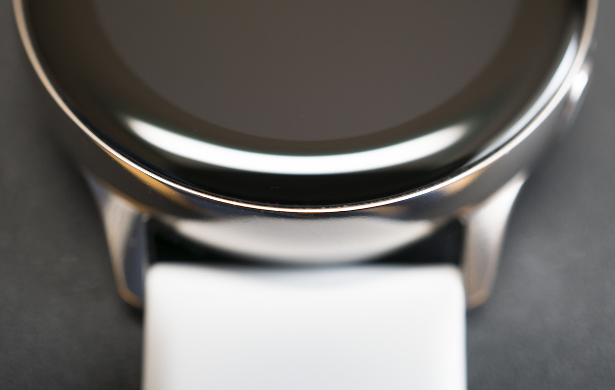
Leaving out the bezel ring means that the peripheral structure of the watch screen becomes very simple. Other smartwatch makers try to make up for the dull image by adding unique patterns on the edges. But the Galaxy Watch Active omitted any decorations around the screen. Samsung probably thought it isn’t worth decorating a watch that will have a simple look anyway.
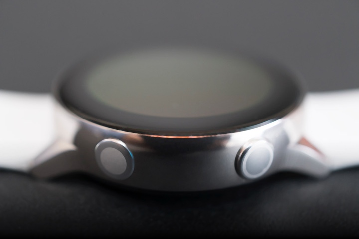
However, the structure of the Galaxy Watch Active that was made according to such judgments, was beyond expectations. There is a hidden charm that maximizes its simplicity. In fact, when you look at the Galaxy Watch Active from the front, you will basically see two things. A black screen and a lug that attaches the strap. By looking carefully, you can see the edges of the main case surrounding the screen and the two buttons placed on the right, but these are just like spices that help better the insufficient taste of the food rather than themselves standing out.
It’s not that the black screen looks flat. Thanks to the glass that covers the screen, the watch has a nice shine. As if washing a black pebble in water and looking at it under the sunlight, the shiny black circle that receives light from the glass looks classy even when the display is off. Although the inner bezel between the round screen and main case sometimes felt irritating, it definitely has been a while since I had a smartwatch that was even pleasant to see a turned-off screen.
On the wrist even when you are asleep
I don’t know how many users will be using the Galaxy Watch Active. But I assume that many users won’t be taking off the watch from their wrists even when they are asleep. Some could lie in their beds with their watches on the wrist to use the sleep-measuring feature, but it is highly possible that more will do so because it is just tiresome to take off the Galaxy Watch Active from their wrists.
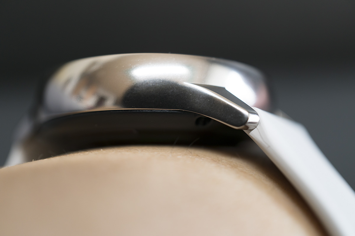
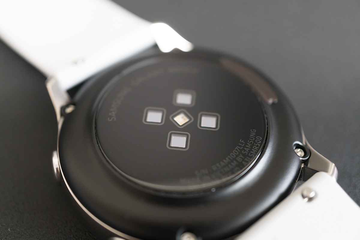
The reason is simple. It means that the fit of the watch is good. I have experienced all smartwatches from Samsung but the Galaxy Watch Active was the first one I didn’t feel any burden on my wrist after wearing it for a long time. The Galaxy Watch Active is light and smooth. The back of the main case where the heart rate sensor is located was made slightly convex unlike the previous models, to give less pressure on the wrist compared to previous generations.
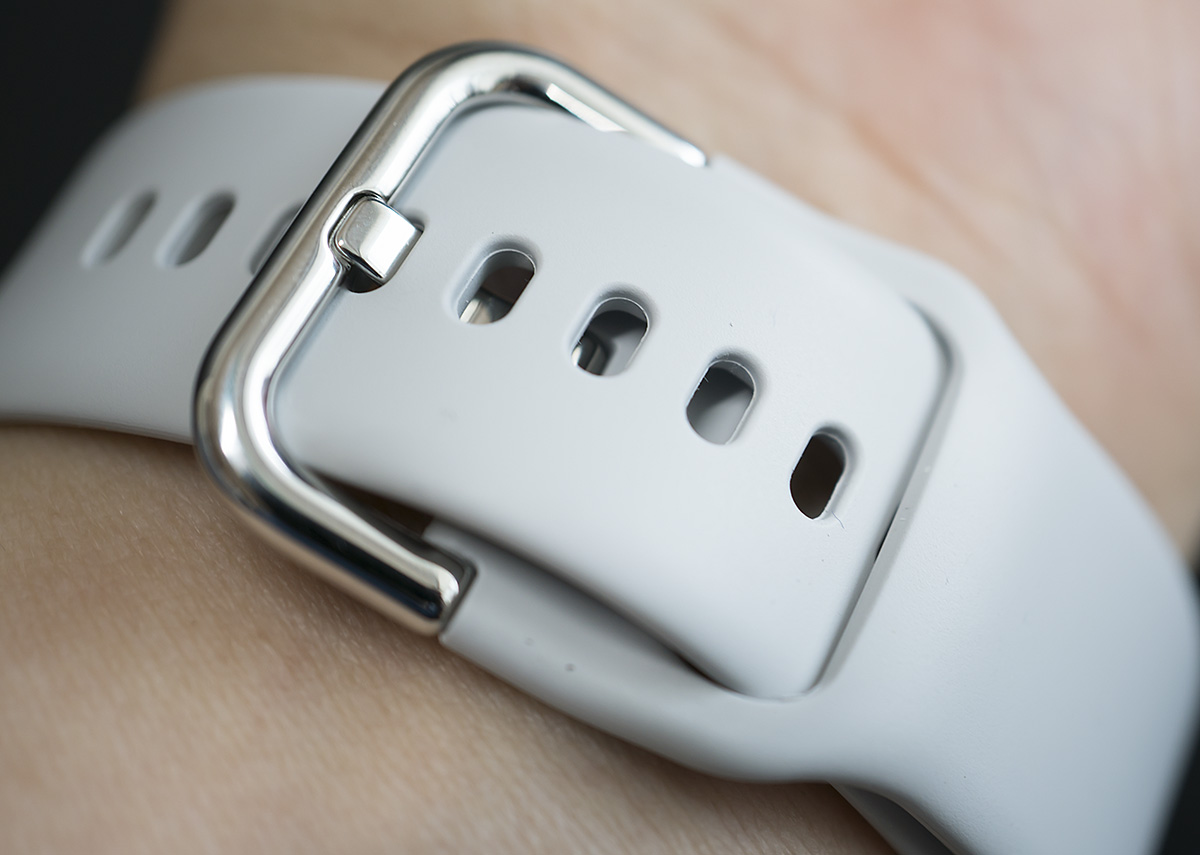
Attention was paid to the basic strap as well. From the outside, the strap looks like an ordinary one made of silicon, but the fluorine-treated strap has a less stiff but softer and smoother texture. The strap stays firm and at the same time gently holds on to the wrist so that the main case remains fixed and the strap is not deformed.
The buckle was modified to place the remaining part of the strap towards the inside of the wrist. Samsung will probably hear some criticism about this part due to the similarity with Apple Watch straps. Nevertheless, because of the absence of a loop in which the remaining strap is put in, it is easy to work without taking off the watch because the buckle of the strap and the loop does not disturb at all when using the laptop with the smartwatch on the wrist.
Almost the same UI, even without the bezel ring
The Galaxy Watch Active dropped the bezel ring and saved the screen, but this doesn’t mean that the screen is big enough. As mentioned earlier, the actual screen is smaller than expected due to the inner bezel. The screen size is 1.1 inch with a screen pixel of 360×360. It’s not that I am enthusiastic about the smaller screen, but it also doesn’t mean that this is all bad. As the distance between the pixels were narrowed due to the smaller screen, letters or images are displayed more clearly.
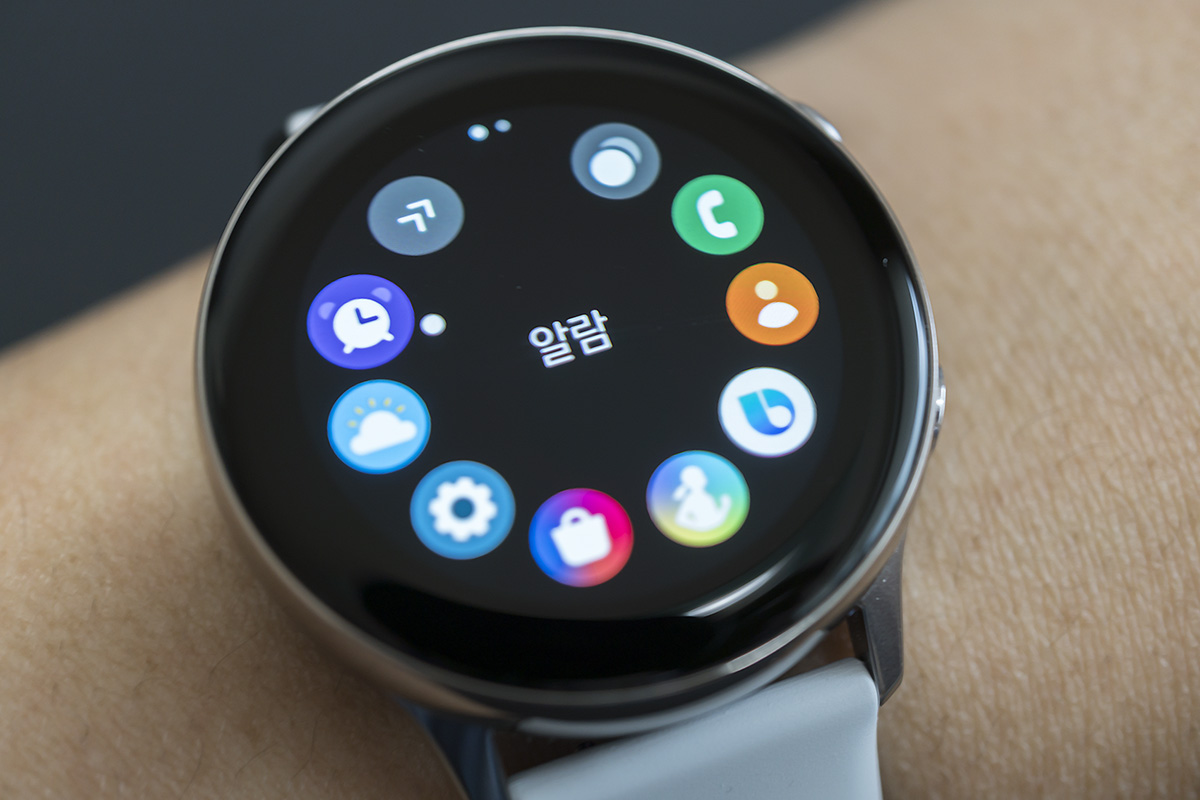
Since there is no bezel ring, everything will have to be controlled by touch. But Samsung kept almost the same UI of the existing Galaxy Watch that had a bezel ring. Apps are in a circular array and page screens are swiped to the left and right. The return button and the menu button are also the same as previous generations.
It’s not inconvenient to use the existing UI by touch without having a bezel ring, but it is less intuitive. Those who have used the Samsung smartwatch before might be familiar with this but for those who are using a Samsung smartwatch for the first time with the Galaxy Watch Active, the circular app launcher or the menu navigation that goes up and down or left and right, might feel less consistent. When Samsung dropped the bezel ring, it should have thought about making changes to this part too. As a user who already used a Samsung smartwatch and is disappointed because of no longer being able to have fun in rotating the bezel ring, I wonder why Samsung kept the existing UI.
Surprising level of battery optimization with most of the existing features included
Two things of the Galaxy Watch Active that give utmost satisfaction are first the fit and secondly, the battery. Actually, it doesn’t really matter which one comes first. This means that battery performance has greatly improved.
A battery of only 230mAh can be used basically for two days or maybe even more. Because you would have only used 50% of the battery after having carried the watch for a full day, measured your sleep and woke up the next morning. You would still have enough battery life the next day without additional charging. It seems that the combination of the Exynos 9110 processor optimized for wearables and Tizen has become much better. However, if you are working out and want to listen to music from the Galaxy Watch Active by connecting the Bluetooth earbuds or a headset, recharging within one and a half or two hours is inevitable. Because, this consumes 8 to 9% of battery within ten minutes.
You can pleasantly listen to music as you won’t be experiencing disconnection when connected with Bluetooth earbuds. Especially, I have never experienced cutoff of music or sound even if I would extremely move my wrist wearing the Galaxy Watch Active. Maybe I haven’t faced yet an exceptional situation, but at least at this time point when I am writing this column, I haven’t found anything that could be problematic. For reference, the Galaxy Watch Active does not enable telephony features for calls made to the connected smartphone even with the Bluetooth earbuds and main case being connected.
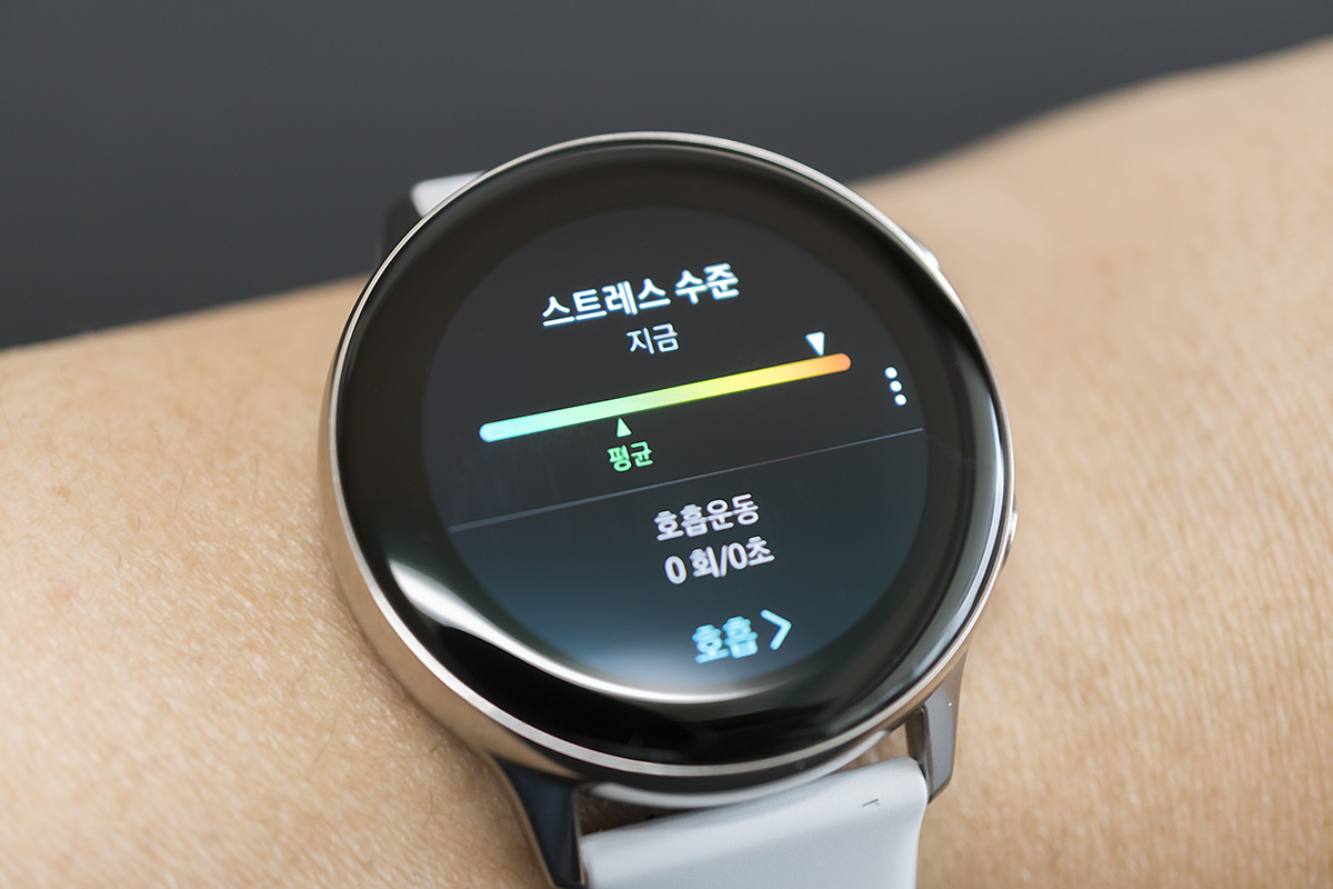
Probably what the Galaxy Watch Active really wants to show are the more precise health features. The step counter can be set to reflect the movements of the user, a water pressure of 50 meters can be endured and the conditions for working out are satisfied with an internal GPS. Nevertheless, the reason why I don’t really want to emphasize too much as a user who has tried the related features, is because the watch has partial similarities with the Apple Watch such as the breathing feature to manage stress. Even the watch face feels similar too. The Galaxy Watch Active has a much better ability of recognizing movements on its own including sleep or heart rate measurement, but I keep on recalling the Apple Watch as I try to explain these features.
Despite some reminiscences of other smartwatches, I do not want the Galaxy Watch Active to stand before the guillotine of criticism, because there are plenty of reasons why this smartwatch deserves far better assessments. I have seen that Samsung made sufficient efforts in the structure, features and performance to prove that it was not a wrong decision to drop the bezel ring. Samsung might heavily focus on promoting its legacy such as the NFC-based Samsung Pay or Bixby embedded in the Galaxy Watch Active. But never mind. The Galaxy Watch Active will show surprising twists going beyond all of that.
Strengths
- The most outstanding simple look since the Gear S2
- Comfortable fit, easy to use
- Reasonable price
- Battery performance good enough to pass
Weaknesses
- Lack of fun in manipulating the device
- Inerasable traces of the Apple Watch


